

Users decide whether to stay on your site or bounce in a fraction of a second. Marketing design has one job: help people understand, trust, and act faster.
The way your pages, emails, or campaigns look and feel can directly impact revenue. Data shows that users form an opinion about a website in just 0.05 seconds, and a staggering 94% of that judgment is based on visual design.
That means even small design decisions, from contrast, spacing, to hierarchy, can tilt millions in revenue.
At the same time, AI is rapidly changing how marketers approach design, offering speed and convenience but also creating new challenges in maintaining quality and originality.
This article breaks down what high-performing marketing design actually looks like today, the principles behind it, and the tools marketers use to execute it well.
Marketing Design as a Growth Lever
Design influences how information is processed. When that processing feels easy, people stay longer and convert more often.
Multiple UX studies show that visual clarity directly impacts trust, bounce rate, and conversion behavior. Pages with a clear visual hierarchy and a single primary goal consistently outperform cluttered layouts across industries.
Strategically placed elements and visual hierarchy can improve engagement and increase conversion rates by 25–40% on high‑converting sites, based on observed user behavior patterns and design choices – one UX analysis on design and conversions reports.
The Core Design Principles Behind High-Performing Marketing Pages
High-performing marketing design is a data-driven framework that prioritizes cognitive ease, visual trust signals, and modular architecture. It focuses on reducing “Interaction Cost” while providing “Visual Proof” to both human users and AI agents (GEO), ensuring that brand value is communicated in under 0.05 seconds.
Most effective marketing design follows a small set of repeatable principles. These are not trends. They are behavioral patterns.
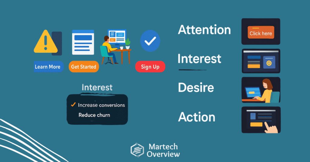
1. AIDA Framework: Attention, Interest, Desire, Action
AIDA remains the gold standard, but the execution has shifted toward breaking information into digestible modules that AI crawlers can index as “Entities.”
- Attention: Use Visual Contrast to anchor the eye. In 2026, this means “Dark Mode” compatibility and high-saturation CTAs that pass WCAG 2.2 accessibility standards.
- Interest: Implement Micro-Copy. Instead of blocks of text, use design to highlight specific outcomes.
- Desire: Replace generic stock photos with Visual Proof. Use annotated screenshots or “lo-fi” human elements to trigger the E-E-A-T (Experience, Expertise, Authoritativeness, Trustworthiness) signals Google looks for.
- Action: The “One-Click” Rule. If the design doesn’t make the next step the most visually obvious element on the screen, the layout has failed.
2. Visual Hierarchy
Visual hierarchy determines what users see first, second, and third.
Size, color, spacing, and placement work together to guide attention. When hierarchy is weak, users are forced to figure things out on their own. Most will not bother.
You know how this looks in practice. Headlines are visibly larger than body text. CTAs stand out from secondary links. Important sections have breathing room.
When it comes to GEO (Generative Engine Optimization), hierarchy also dictates what the AI summarizes.
- Size & Scale: Use $H1$ through $H4$ tags not just for SEO, but as visual anchors.
- The “F-Pattern” vs. “Layer Cake”: Most users now scan in a “Layer Cake” pattern (reading headings and skipping body text). Design your pages so that reading only the headlines tells the (almost) full story.

3. Cognitive Load Reduction
People avoid interfaces that feel mentally taxing. This is known as cognitive load, and design plays a major role in controlling it.
Research on processing fluency shows users prefer designs that feel easy to understand and navigate. This fact has not changed since the 2000’s and will not change in the era of AI.
Take this situation: Instead of listing ten features at once, a page introduces three core benefits and lets users explore details progressively.
Keep an eye out for:
- Processing Fluency: Users prefer designs that feel familiar. Using standard UI patterns (like a top-right “Login” button) reduces the mental energy required to use your site, leaving more “brain power” for the conversion decision. (Jakob’s Law of Internet User Experience)
- Progressive Disclosure: Don’t dump all features at once. Use “Show More” or tabbed designs to keep the initial view clean.
In a world of AI-generated noise, Simplicity is design is a Luxury Signal.
4. Consistency and Familiar Patterns
Consistency builds trust. Familiar layouts reduce learning effort and makes for friendly ux
For example, Pricing tables that follow standard left-to-right comparisons or forms that behave the way users expect on mobile devices.
When users do not have to learn how a page works, they focus on deciding whether to convert.
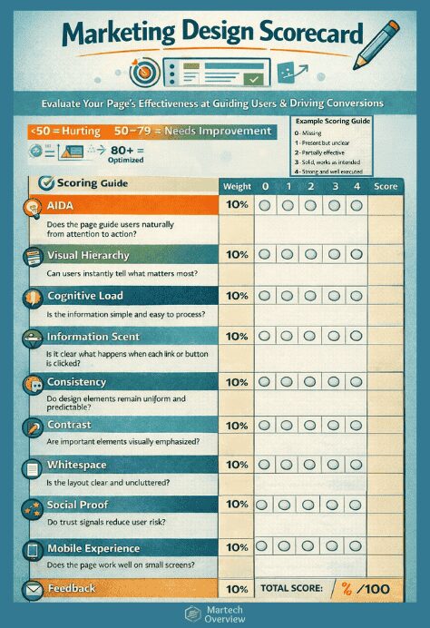
5. Technical Trust & Accessibility
High-growth brands no longer treat accessibility as a checkbox; rather see it as a pillar of performance.
| Design Element | Impact on Growth | AEO/GEO Benefit |
| Alt-Text Strategy | Improves Image Search ranking | Helps AI “understand” your product visuals |
| Semantic HTML | Improves screen reader UX | Direct data-feed for Answer Engines |
| Contrast Ratio | Reduces bounce rate in mobile/outdoor use | Signals “High-Quality Content” to crawlers |
Design Choices That Directly Influence Conversion
Certain design elements have an outsized impact on performance.
- Whitespace: Spacing improves readability and comprehension. Crowded pages feel harder to use and less trustworthy.
- CTAs: Clear CTA design matters. Tests consistently show that button placement, contrast, and wording affect click-through rates .
- Forms: Reducing the number of form fields can dramatically increase submissions. In some experiments, cutting unnecessary fields more than doubled completion rates .
Real-World Design Patterns Used by High-Growth Brands
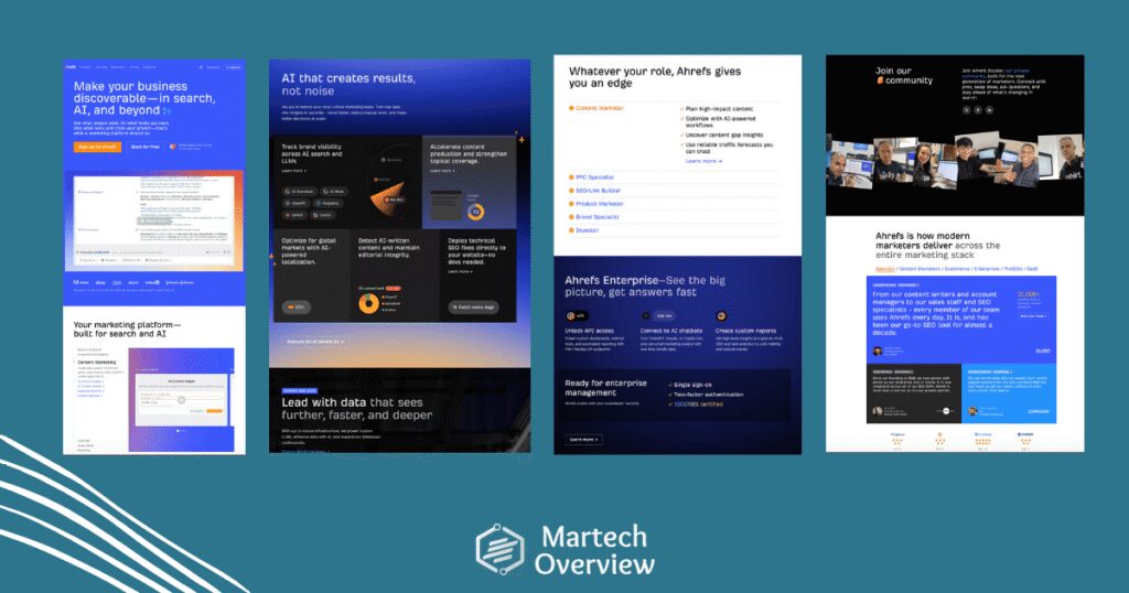
High-growth companies reuse proven design patterns rather than chasing novelty: modular sections, annotated product visuals, and outcome-focused testimonials.
- Hero sections with a single message and one primary action
- Modular sections that can be scanned independently
- Product visuals annotated to show value, not aesthetics
- Testimonials that highlight outcomes, not compliments
These patterns work because they align with how people actually read and decide their next steps online.
Take a look at Ahrefs’ homepage as an example 👇
🎨 Design in the Era of AI: Fast Doesn’t Have to Mean Sloppy
From auto-generating graphics to layout suggestions and copy-assisted visuals, AI is all around.
But while AI can accelerate design, it also introduces new challenges: walking the line between fast and high-quality design has never been more important.
What’s Changing with AI
You can’t ignore AI, but you can adapt and use it to your benefit. A few highlights:
- Speed and iteration: AI tools like Canva Magic Design, Figma’s AI Assistant, and Adobe Firefly can generate dozens of layout options or image variations in minutes.
- Accessibility: AI lowers the barrier for non-designers to create visuals that “look good enough.”
- Risk of homogenization: AI-generated designs often look similar because they rely on existing datasets. Originality can suffer if you rely too heavily on AI alone.
Ensuring Quality Over Speed
To keep quality at high standards, human judgement remains essential. Here’s your role:
- Clear objectives: AI outputs are tools, not final products. Start with a goal like “increase signups” rather than “make a poster.”
- User testing: Heatmaps, scroll tracking, and A/B testing still matter.
- Consistency and brand alignment: AI might produce visually appealing but off-brand assets. Check color palettes, typography, and tone.
- Iterative review: Generate multiple AI options, then refine with human expertise.
Pros: What AI Tools Do Well
This is an opportunity to speed up your process and hand some of the workload to AI.
- Rapid ideation: multiple layout or style options in minutes
- Routine assets: social posts, banners, email headers
- Data-driven suggestions: some tools suggest colors, layouts, or typography based on engagement trends
Cons: Where AI Falls Short
Use your best judgement and double-check/edit the most common AI fails.
- Nuanced messaging: subtle persuasion is often missed
- Contextual understanding: hierarchy and prioritization can be off
- Originality and brand storytelling: AI relies on patterns from existing designs

Blending AI With Real Design
The sweet spot is AI-assisted design:
- Use AI for rapid drafts or exploring multiple visual directions
- Apply human expertise for selection, refinement, and execution
- Example: AI generates three hero image options, a designer tweaks spacing, hierarchy, and brand alignment
This hybrid approach helps speed up the process without sacrificing quality: design remains strategic, user-focused, and conversion-driven.
Top Design Tools Marketers Rely On in 2026
Modern marketing design is collaborative, fast, and iterative. These tools show up consistently across high-performing teams and are commonly covered on Martechoverview.
- Figma: Used for interface design, collaboration, and rapid iteration across marketing and product teams.
- Canva: Popular for quick campaign assets, social visuals, and templates that do not require deep design expertise.
- Webflow: Combines design control with production-ready websites, making it easier for marketers to launch and test pages without heavy development cycles.
- Adobe Express: Often used for branded assets and lightweight creative work tied to existing Adobe workflows.
Discover other Design tools
👉https://tools.martechoverview.com/
Find the right tool, with the right features, at the right price.
Mobile Design Dominates
Mobile traffic dominates across most industries. Pages that are difficult to use on small screens lose conversions quickly.
Studies consistently show higher bounce rates when mobile layouts require excessive zooming, scrolling, or tapping precision .
Google data indicates that text that is too small to read on mobile (requiring zoom) increases bounce rates by ~73%, and clickable elements placed too close together (leading to mistaps) increase bounce rates by ~47% on mobile devices.
Effective mobile marketing design focuses on:
- Large tap targets
- Short content blocks
- Clear visual separation between sections
- Design Without Measurement Is Guesswork
- Strong teams treat design as an ongoing experiment.
Heatmaps, scroll depth analysis, and A/B testing reveal which visual decisions help users move forward and which create issues.
Multivariate testing has been shown to uncover combinations of layout, copy, and visuals that outperform single changes.
Final Takeaway
Marketing design works best when it is treated as a system, not a surface.
The teams that win the performance grand prize focus on clarity, hierarchy, psychology, and measurable outcomes.
They rely on proven principles, modern tools, and continuous testing rather than trends or personal taste.
When design helps users understand faster and act with confidence, growth follows.